MY ROLE Lead Product Designer, Prototyping, UX Research
Project Overview
THE PROBLEM
For our audience: We needed to create a single lander that promotes all Fast Company events, allow users to register and showcase past event content.
For potential partners: We needed to showcase the types of programming/events that can be facilitated so they can see the value that would be offered by partnering with Fast Company.
THE GOAL
Create a content-rich digital lander for all Fast Company events that will increase awareness about all our events with a full calendar and seek to develop an audience for our events. The lander should also provide links to past event videos, with the option to gate that content behind a paywall.
Metrics for success: Video views, increased event registrations, money sold for paid partner events, increased page views to Events Hub
Understanding the Competition
I compiled competitor use cases and produced product research for optimal calendar experiences. The Product Team received a long list of requirements we needed to deliver and I had to figure out how to execute an experience that wasn’t complicated for our audience. Ultimately, we were able to remove some requirements, like filtering capabilities, in order to compile more user research at a later time.
I looked at direct competitors like WSJ, The Economist, Fortune and The New Yorker to see how they showcased their events. I also looked at indirect competitors like TedTalks, Ticketmaster, Splash and YouTube for design insights. Below is what I learned.
OPTIMIZE COMPONENTS FOR MOBILE
This was an opportunity to update our current Design System to be more mobile-friendly. I was able to present solutions for larger button sizes and other UX iconography like up/down arrows for expandable dropdowns. I also provided solutions for increased padding around tappable elements and increased page margins.
FOCUS ON PRIMARY ACTIONS
A lot of content can be overwhelming, even though it may all be useful to some degree. The busier the event site, the more likely a user won’t find the actions they need to take. The more successful sites organized event information in smaller content groups allowing the main CTAs to stand-out.
SHOWCASE THE EVENTS
On all the sites I reviewed, the more successful ones showed image and video content that expressed the overall experience of the events they produced. Potential registrants need to see what the events are like and what they can gain by attending them.
SIMPLIFY TAGGING
Too many different category tags can overwhelm the user. We had to narrow down what was most important for the user to see. Competitors typically had event type, event name, and event date/time and it was clear it was quick to understand.
Wireframes
There were quite a few rounds of wireframes that were produced. Many product discussions happened about requirements and I had to present new solutions each step of the way as those requirements changed. We knew there were too many and I kept thinking we were overcomplicating this experience.
User Test
After producing multiple versions of a mobile-first approach to the wireframes, we were able to narrow down options and I created prototypes for user testing. We learned, as I already assumed, that we had to take a much simpler approach. We tested a single page approach versus a tabbed experience to see which the user preferred and which allowed for quicker actions. I designed prototypes that simplified the user journey by reducing the number of content tags in order to prioritize quick user actions, either registering for an upcoming event or watching past event videos.
INSIGHTS
All prototypes allowed users to easily find events they wanted to register for.
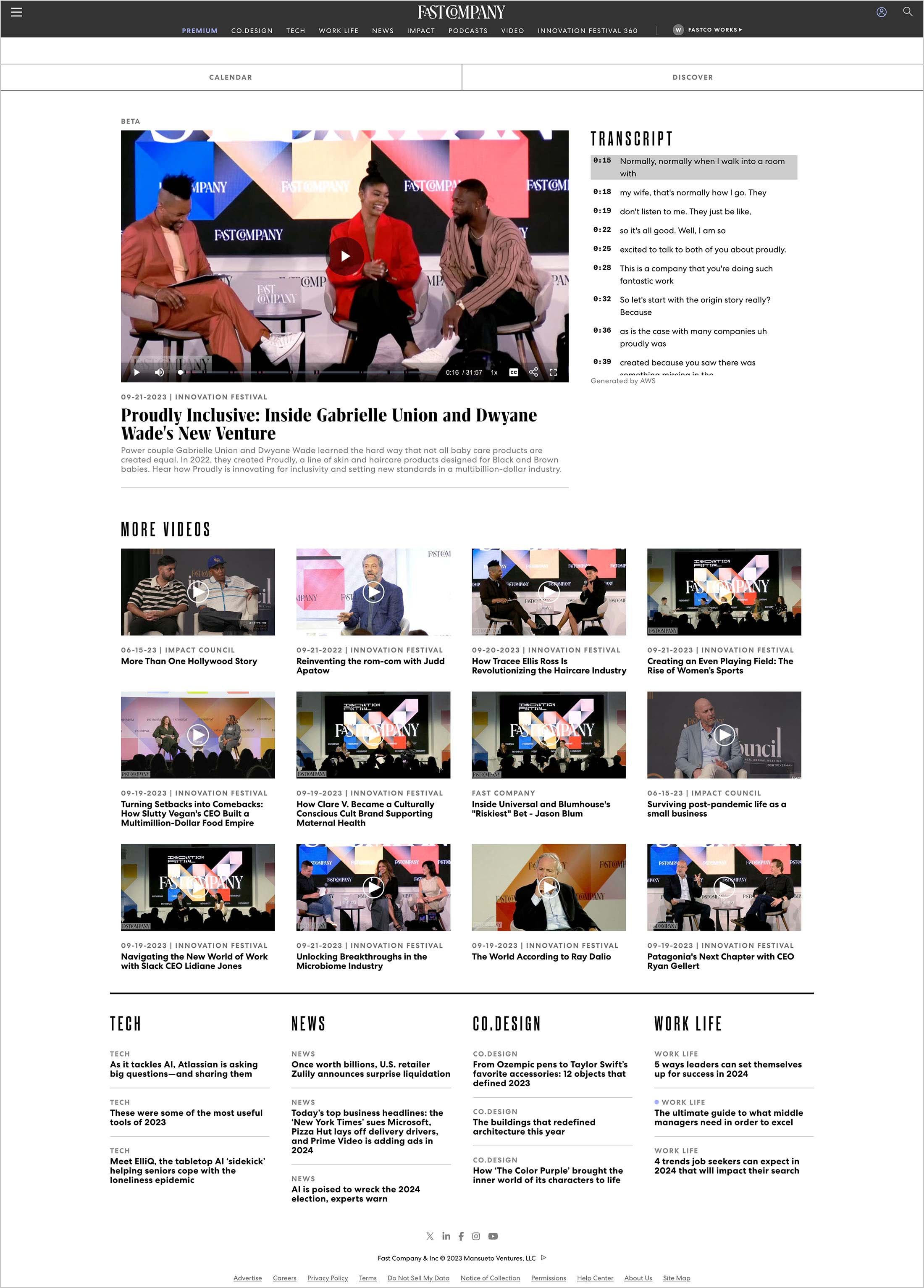
Video content is more important to the experience than we thought and the tabbed experienced allowed users to find video content more easily. This insight helped us prioritize the Watch Page experience by enhancing the transcribing experience next to the video player.
Users are viewing video content regularly throughout their day on both mobile phones and their desktop computers.
Final Designs
I was able to successfully propose a simplified content experience for these designs. By keeping the content more high-level, the user is able to quickly scan and make an action more quickly. I took inspiration from competitors and showcased our event experiences with a large header area with images of engaged crowds, happy attendees and lively panelists.
Key Takeaways
IMPACT
Overall, I’m happy with the experience we launched with. It was the first product we produced with AI integration that produces transcripts for video content. We will continue to optimize the experience as we gather data that will help inform our approach for executing a similar experience for Inc. in the future.
WHAT I LEARNED
I learned that I needed to follow my instincts and keep users top-of-mind with so many requirements that needed to be addressed for this product from internal stakeholders. I learned I can lean on more SEO and backend structures in order to simplify the frontend experience for the users. We were able to develop a content tagging structure on the backend in order to offload unnecessary categories on the frontend.


