MY ROLE Lead UX Designer, UX Researcher
Project Overview
THE PROBLEM
Busy families need to keep track of their changing schedules easily and quickly so they can organize their time while reducing stress.
THE GOAL
The calendar app will let users manage both their schedules and their family’s schedules, which will affect how busy families stay organized by giving them the ability to make changes easily and quickly while notifying family members of schedule changes.
Understanding the User
I conducted secondary research to gather insights about mobile usage, dyslexic users and competitive analysis into existing scheduling apps. I already knew we have transitioned into a mobile-first culture, but I didn’t know just how far we’ve come. By mid-2023, it was estimated that almost 96% of the global population used a mobile device to connect to the internet.
I also had no idea that it’s estimated that 1 out of 10 people in the world has Dyslexia. More than 40M adults in the US have Dyslexia, with only 2M of them receiving a diagnosis.
People are spending too much time scheduling (~3-4 hrs a week) and there are opportunities to help reduce that. Competitors like Google Calendar and Apple Calendar are already pre-loaded on phones for mobile users and have syncing capabilities across devices. Users left reviews reporting bugs and in some cases the user experience wasn’t intuitive and had to be learned, increasing cognitive load.
LITTLE TIME
Users don’t want to spend so much time finding schedules and adjusting them.
LACK OF CONSISTENCY
Users want some form of confirmation when schedules have been updated.
READABILITY
Older users can’t read small type and Dyslexic users need adjustable preferences for an optimal experience.
CANCELLATIONS
Sometimes things happen when users least expect and they have to cancel plans at the last second.
Wireframes & Low-Fidelity Prototype
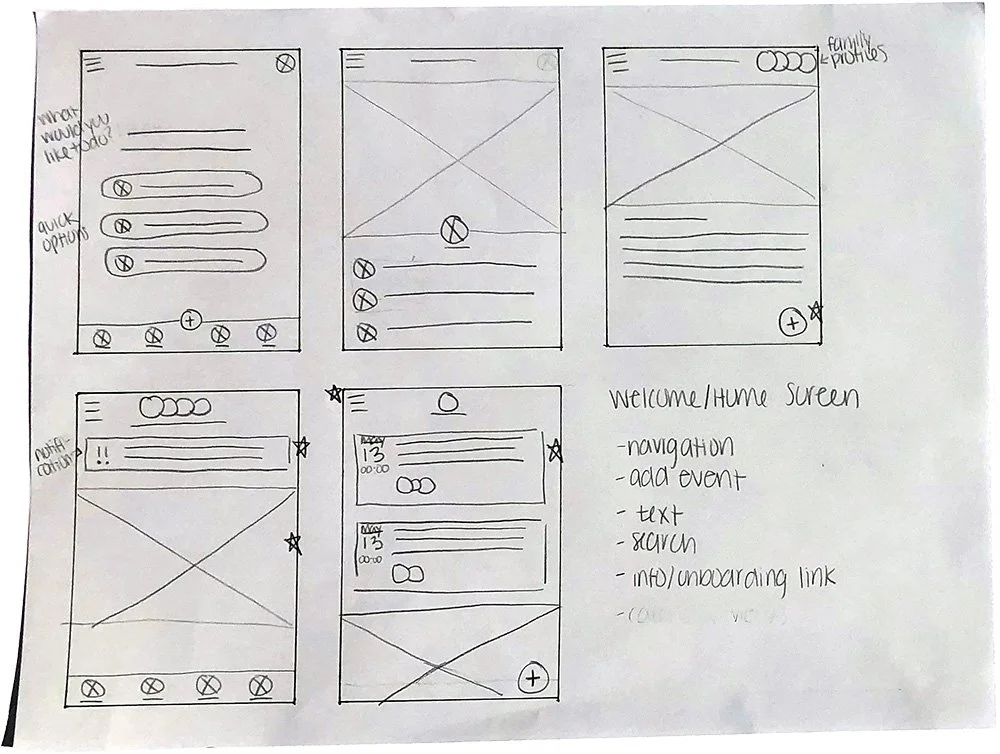
I was questioning how much initial interaction I want to allow the user, because I want them to be able to complete a task as easily as possible. My approach was to put forward some "quick actions" so users don't have to spend additional time navigating within the app.
LOW-FIDELITY PROTOTYPE
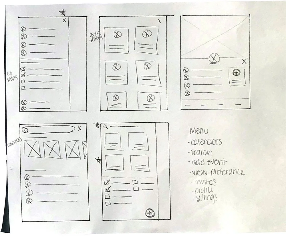
I wanted to give the user options for how they would prefer to move through the app. However the user prefers to add an event, they have multiple ways to do that and can get back to their previous screen easily.
You can interact with the prototype here.
Usability Study
I executed a simple, unmoderated study instructing participants to complete 5 prompts with follow-up questions. I asked participants to record their screens while interacting with the prototype and provide their thoughts and feedback outloud.
INSIGHTS
Allow users to have navigation options and provide clear text indications. More conversational labels were confusing to participants.
Participants were familiar with the experience because of similarities to calendar apps they currently use. This conditioning allowed participants to navigate the experience more easily.
Having a centralized calendar is essential. Participants needed to easily share schedules with family members but also organize their personal schedules separately.
Revised Wireframes
HOMEPAGE
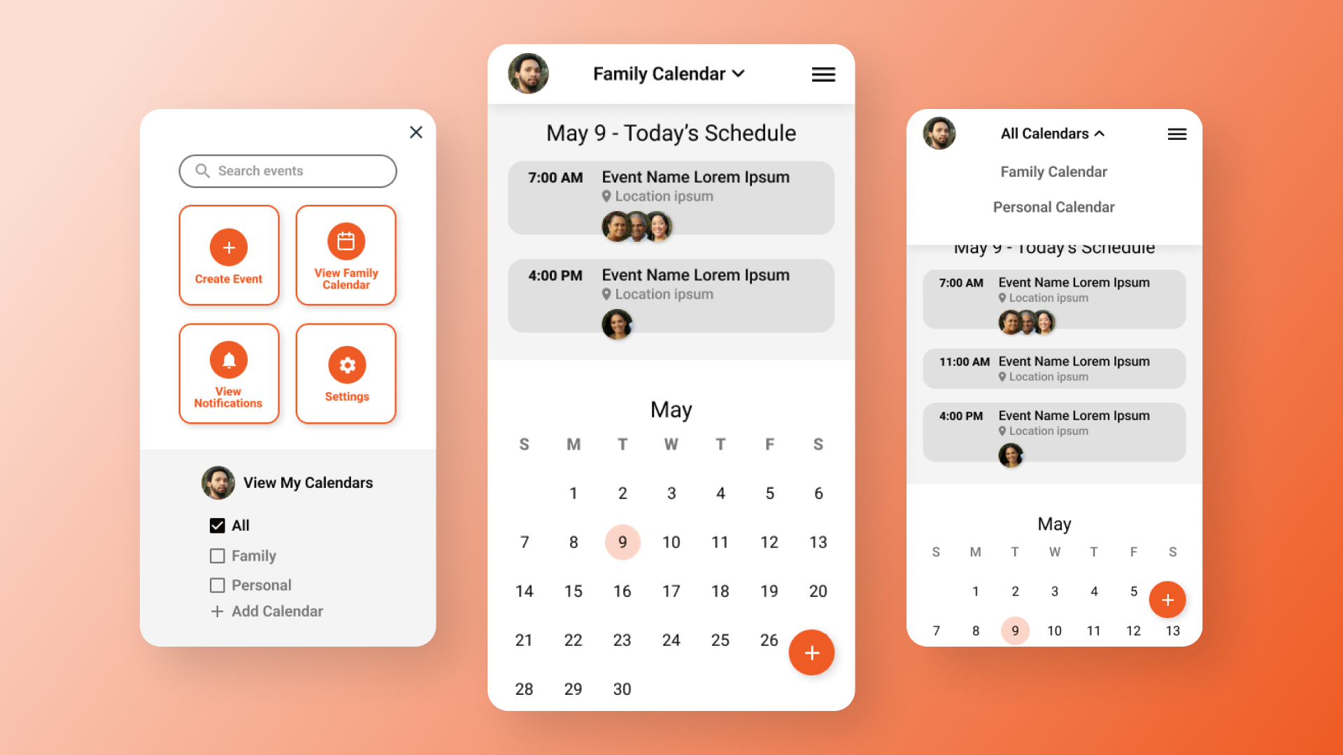
Even though most participants easily found “Today’s Schedule,” I noticed they still had some hesitations to be sure that’s what it was. I updated the copy to communicate more clearly. I also added an additional navigation option for users who want to click on today’s date to see more event details.
MENU
I needed to continue to communicate more clearly with the copy for buttons as well. Adding consistencies with icons and labels allow the user to navigate more easily.
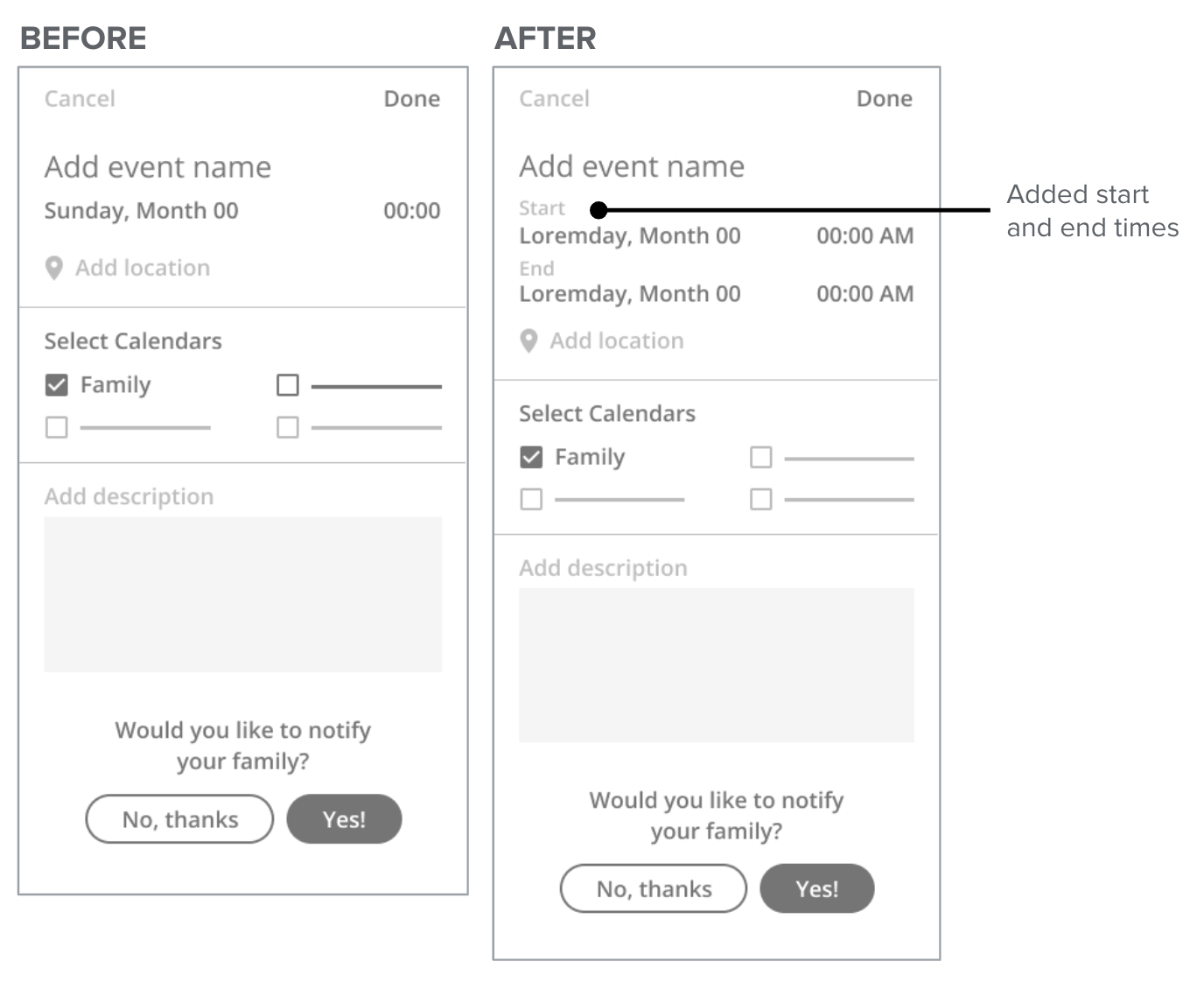
EVENT DETAILS
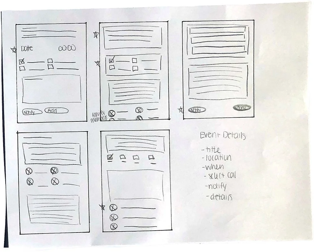
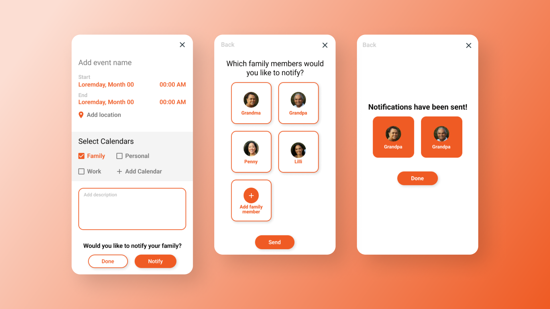
A participant communicated that I missed both the start and end times. Without having that, it confused the participant for knowing how they would add that necessary information for creating an event.
Design Mockups & High-Fidelity Prototype
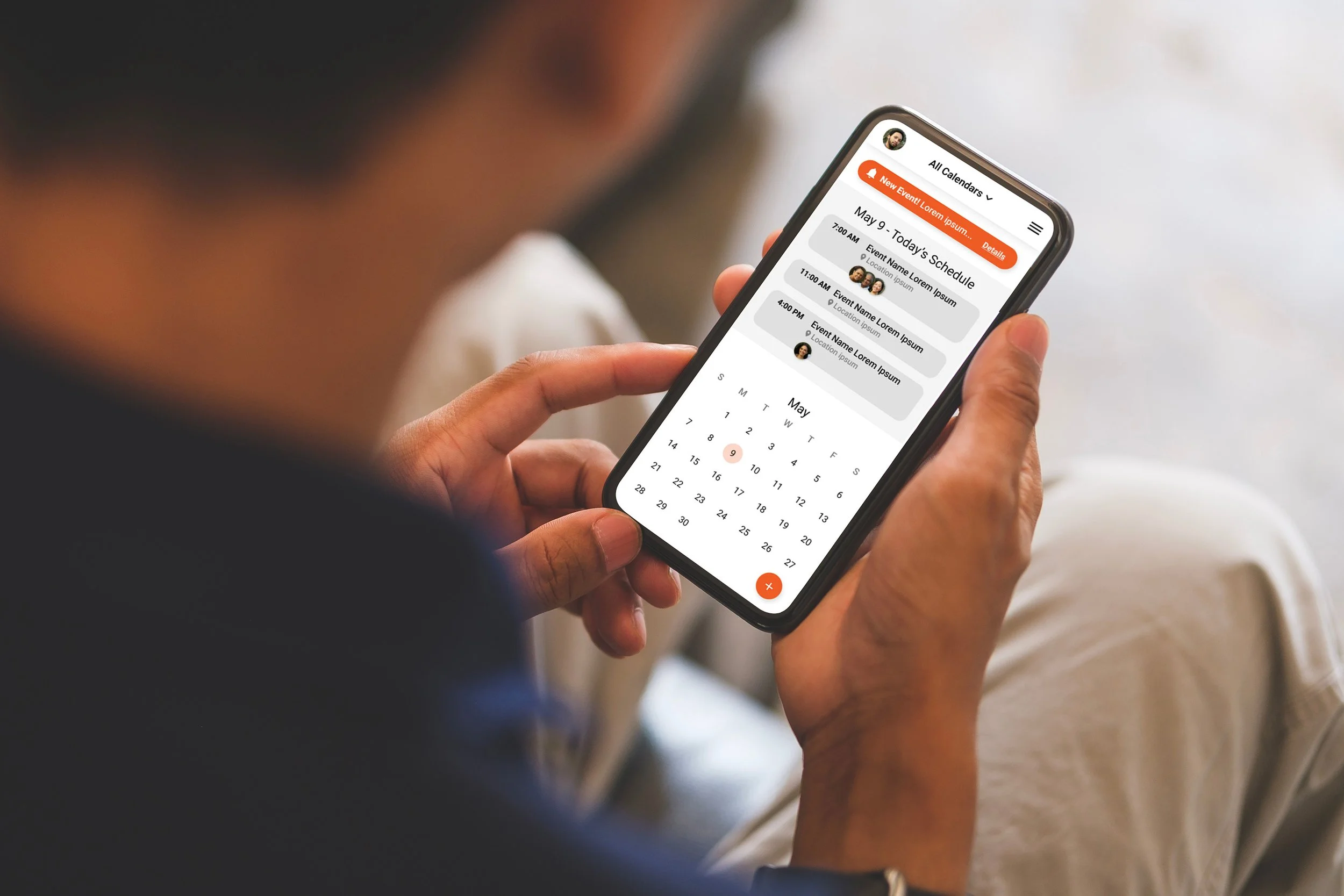
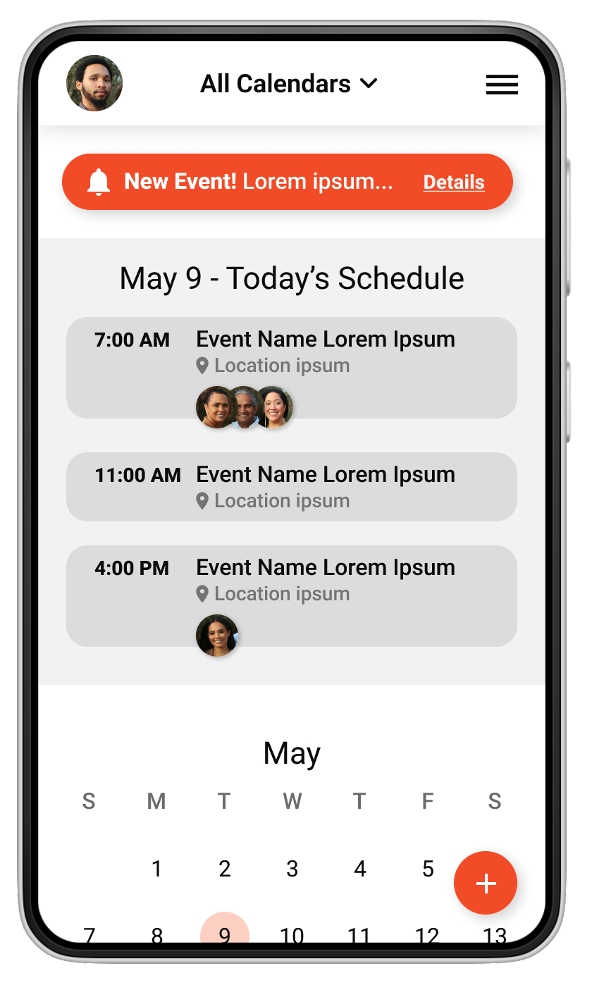
My goal for the design was to keep it as simple as possible and allow the user to easily navigate the experience. I kept the color palette minimal, still allowing for visual contrast. The text elements become more muted, but clearly communicates to the user what their purpose is. The icons I used are universally known and text indicators are added as well so there’s no guessing. To allow users to easily complete their tasks without much thinking, user actions stand out with bright red/orange buttons and text. I further enhanced button and navigation visual cues by adding drop shadows that lift them off the background of the screen.
HIGH-FIDELITY PROTOTYPE
I enjoyed learning more about adding smart animations to my navigation. It certainly adds to the experience.
You can interact with the prototype here.
Key Takeaways
IMPACT
I feel I was successful in designing a product that would be very useful for families.
"It's a great shared resource for your family. It’s a good time for me to start using something like this as my family is growing, and it would be nice to have everyone's schedule in one place." - Usability study participant
WHAT I LEARNED
I learned that I needed to allow users the ability navigate the experience the way they found it to be easiest and quickest. I also needed text to communicate clearly to the user without confusing them. Users with dyslexia were top-of-mind and my design decisions were based on additional design research I conducted for those users in order to improve their reading experience. I used solid color backgrounds, optimized typography stylings, used an active voice throughout and kept language as simple and clear as I could.
